Case Study
Elevating an established brand
When our colleague Cohen Partners approached us to help revitalize the vehicle graphics for their client American Alarm and Communication Inc. (AACI) we were happy to help.
CHALLENGE:
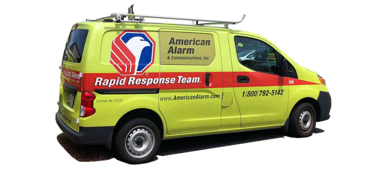
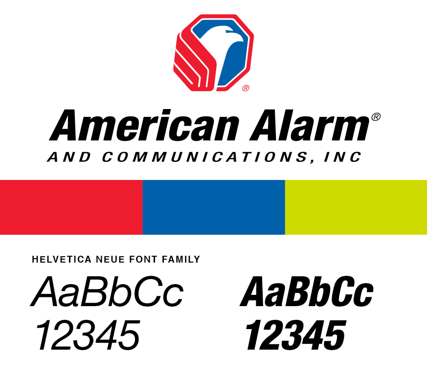
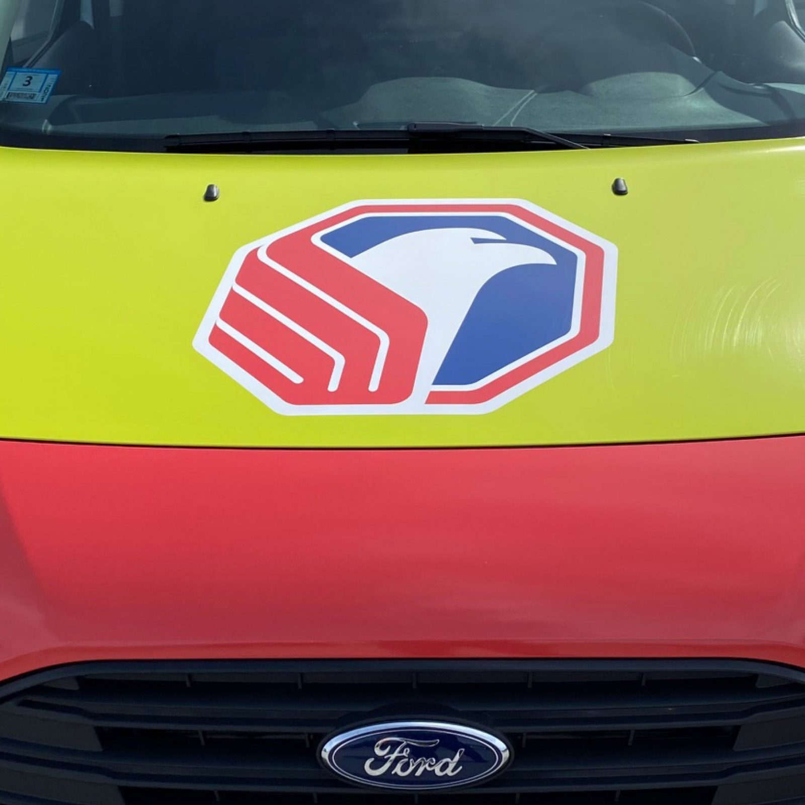
AACI has over 100 vehicles in their fleet, rolling across New England. Over time, as vehicles were replaced the graphics began to drift. The brand was visually inconsistent and diluted. AACI leadership knew it was time to strengthen and standardize the brand. The assets that were provided and mandatory to the design were their logo, the font Helvetica and color palette — especially the safety yellow/green. AACI had adopted this color decades ago, because studies had shown it was the most visible color on the road, even in difficult weather conditions.
SOLUTION:
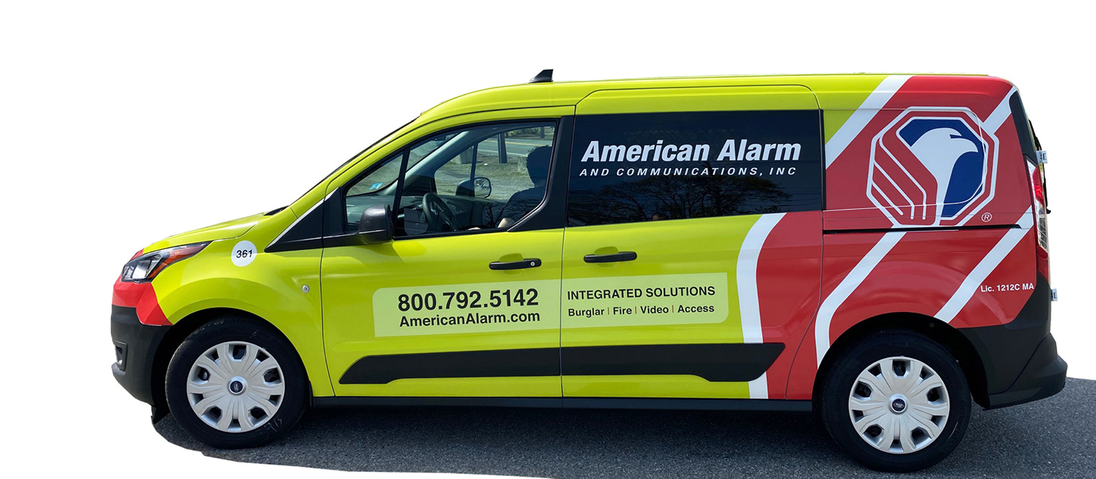
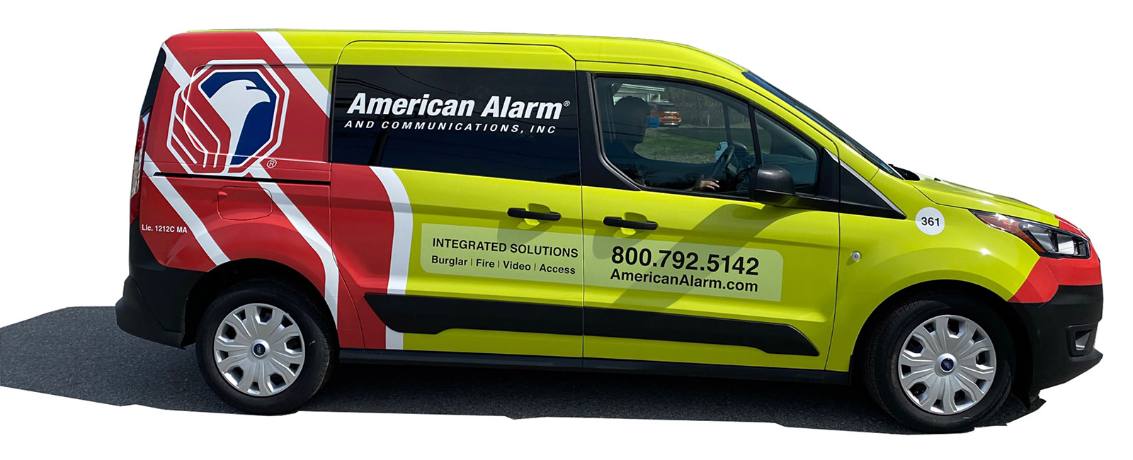
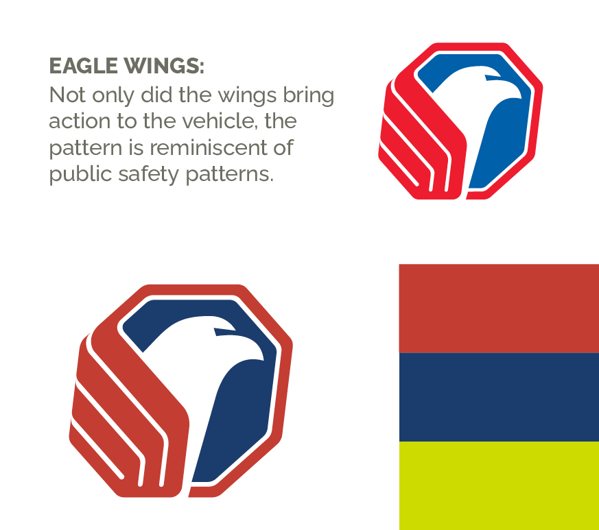
Vehicles are moving billboards, and like billboards, you only have a few seconds to capture attention. We wanted to identify a strong simple design that worked at a distance and also effectively communicated the visual brand — we found that in their logo itself. This pattern was truly unique to AACI helping to elevate the brand.
COLOR:
In strengthening the graphics, we found that the original colors seemed weak and became washed out when used outside. We suggested a new red and blue that were richer and stronger .
